Interaction Design · Product Design · Sustainability
GIDO — Recycling Assistant
A physical recycling assistant designed to make correct waste sorting easier through intuitive interaction, immediate feedback and accessible knowledge. Developed as a collaborative group project, with my contribution focused on shared concept and interaction development, as well as the content and visual design of the project booklet together with a classmate.
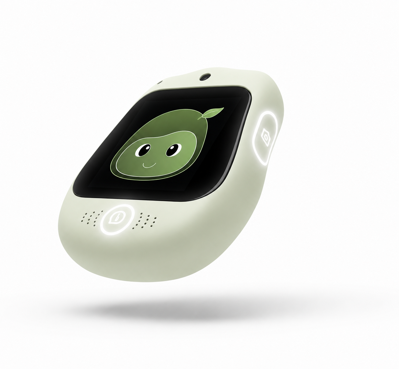
GIDO — Skanna lätt. Sortera rätt.
- Project type
- Interaction Design · Product Design · Sustainability
- Course
- Group project
- Autumn 2025
- Year of study
- Year 4 of 5
- Duration
- Team
- Group of 5
- My role
- Shared concept development and interaction design, with a particular focus on the content and visual design of the project booklet together with a classmate
- Tools & methods
- Concept development · Customer journeys · Interaction design · Product concept · Booklet design
- Prototype
- Physical product concept and printed booklet
The problem and behavioural context
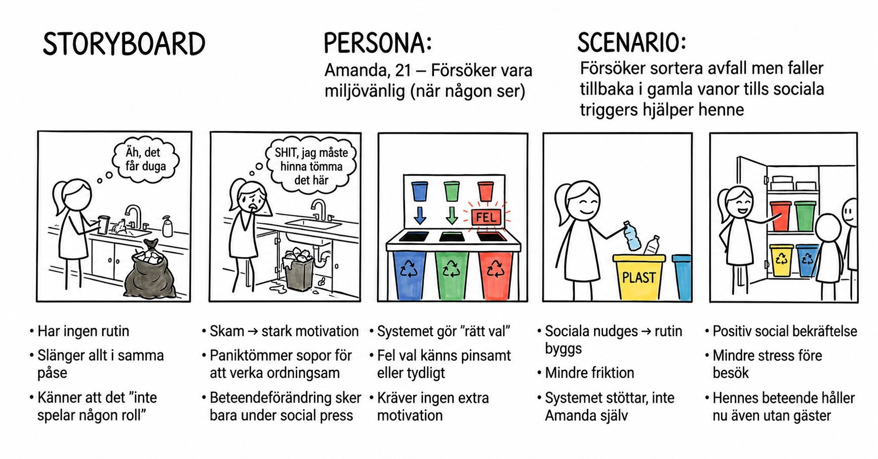
Many people want to recycle correctly but hesitate when information is unclear or difficult to access. Uncertainty, limited knowledge, time pressure and the effort of searching for answers can all create barriers at the moment of sorting.
GIDO was therefore developed to provide immediate, supportive feedback when uncertainty occurs. The aim was to reduce friction and make additional learning available without relying on guilt or pressure.
The concept
GIDO is a physical recycling assistant for the home. Users scan an item and receive immediate sorting guidance, with the option to access additional information.
Because the project was developed within an interaction design course, the main focus was the interaction, feedback and user understanding rather than a fully refined final product appearance.
Team & collaboration
This was a collaborative project developed by a team of five. We shared the main concept and interaction design work, while responsibilities became more focused during the final stage.
My particular contribution was the content and visual design of the project booklet, developed together with a classmate.
Customer journeys
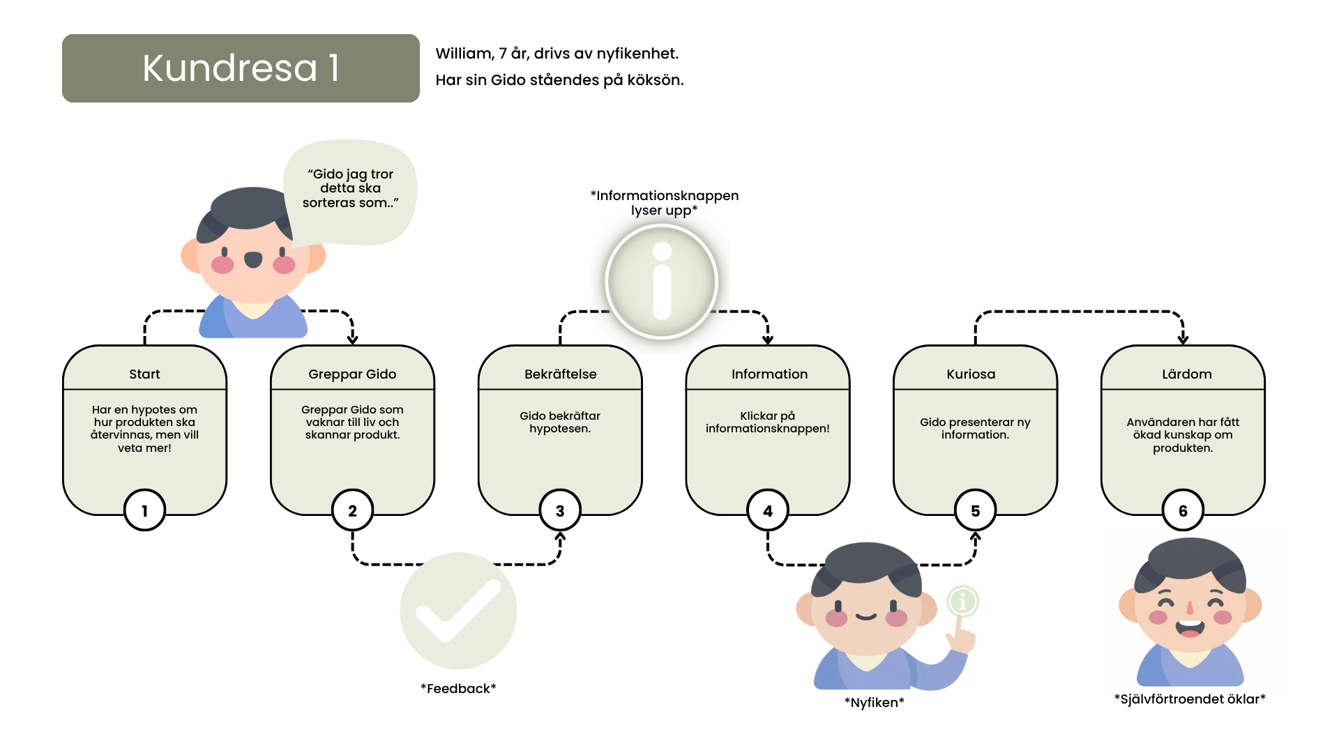
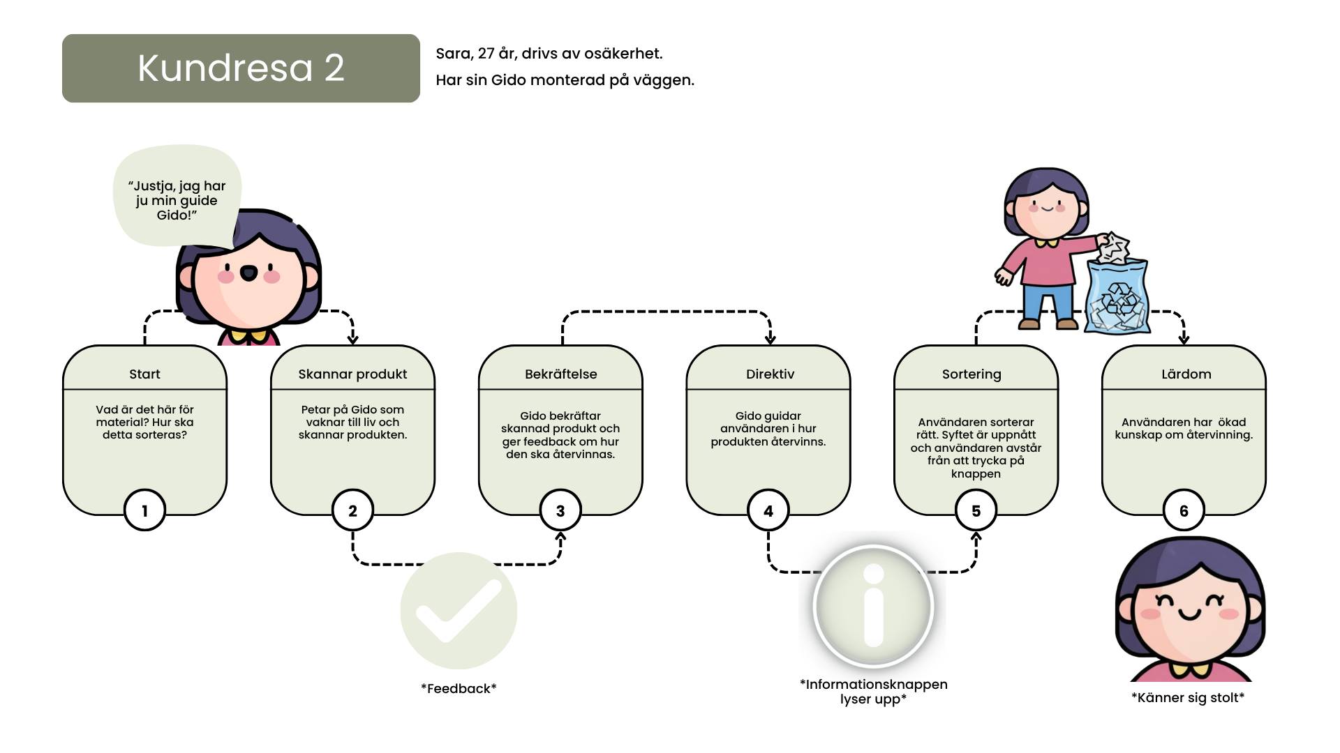
We developed two customer journeys to explore how GIDO could support users with different motivations and levels of confidence.
William, 7 years old, is driven by curiosity and keeps GIDO on the kitchen island. In this scenario, GIDO supports exploration and learning by confirming the child's hypothesis and then offering further information through the information button.
Sara, 27 years old, is driven by uncertainty and has GIDO mounted on the wall. In this scenario, GIDO helps her identify the material, confirms the scan and guides her toward the correct sorting choice, helping her feel more informed and confident.
Interaction principles
The interaction was designed to be quick, intuitive and supportive. Scanning provides immediate feedback, while an information button allows users to access additional knowledge when they choose.
This approach supports informed and autonomous behaviour rather than relying on pressure or forcing users through unnecessary information.
Physical prototypes
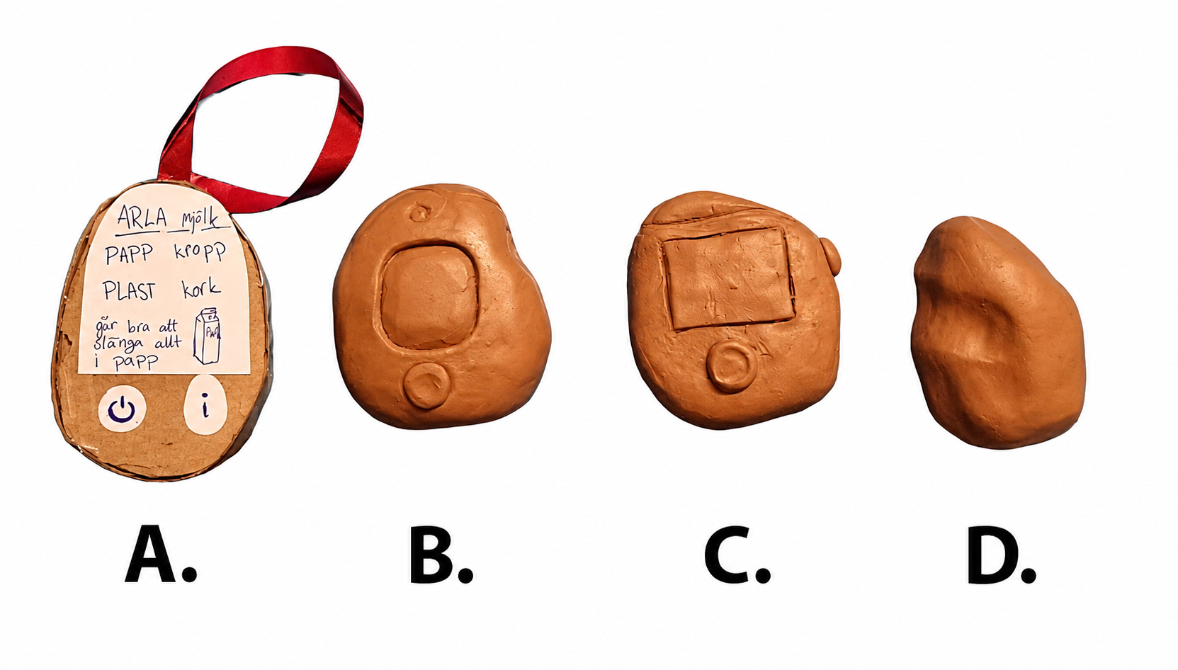
We created four physical form studies to compare shapes, handling, screen placement and interaction points before the technical system existed.
The models also helped us evaluate how clearly users understood the product's orientation and the placement of the screen, camera and buttons.
User testing and evaluation
We tested the concept with five participants using scenario-based think-aloud testing, A/B comparison, Wizard of Oz simulation and a cognitive walkthrough.
Because the prototypes were not technically functional, system responses were simulated through a prepared interaction script. Participants first sorted objects independently and then repeated the task with support from GIDO, allowing us to compare accuracy, completion time and confidence.
Sorting without GIDO
Participants sorted the selected objects using their existing knowledge.
Sorting with GIDO
Participants repeated the task with access to the prototype and simulated feedback.
Results
5 participants
Fewer sorting errors for 4 of 5 participants
Approximately 2 to 4 times longer with support
Immediate learning observed for difficult items
Four of five participants made fewer sorting errors with support from GIDO. Although the process took longer, several considered the additional time acceptable when they felt uncertain.
Immediate learning was also observed for difficult items, suggesting that GIDO could support both correct decisions in the moment and knowledge over time.
What the tests revealed
Camera placement needed to be clearer
Users did not always understand where the camera was located or how to position the object. Some covered the camera or moved the product as though scanning a QR code.
Buttons needed clearer meaning
The side button was sometimes interpreted as a camera trigger, showing that the relationship between controls and system feedback needed to be clearer.
Additional information should remain optional
Participants appreciated the information button but wanted to decide when to access more detail. They also needed both visual and spoken feedback rather than sound alone.
Feedback and UX writing
The system feedback could confirm a correct choice, identify the material, provide sorting guidance and offer optional additional information.
The UX writing was kept clear, supportive and practical. Positive feedback built confidence, while longer explanations were shown only when requested.
Booklet
The final project booklet communicates the problem framing, concept, user scenarios and interaction design. I developed its content and visual design together with a classmate. Selected pages are presented below in an interactive gallery.
Click any page to open the interactive viewer
Final outcome
The final concept is a soft and approachable physical recycling assistant for everyday use in the home. Immediate feedback supports correct sorting, while optional information helps users build knowledge without interrupting the interaction.
GIDO combines practical guidance with a friendly visual character intended to make uncertainty feel easier to manage.
Reflection
This project strengthened my experience of collaborative concept development while also giving me ownership of a defined deliverable. Developing the booklet with a classmate improved my ability to structure design material and communicate a concept visually.
The evaluation showed that clear interaction and feedback were more important than resolving small visual details too early. Users needed to understand what to do, what the product had detected and what would happen next.
The project also deepened my interest in how physical products, system feedback and UX writing can support behaviour while preserving the user's autonomy.