UX Research · Usability Testing · HMI · Interaction Design
Volvo Infotainment Usability Study
A comparative usability study exploring how the structure and accessibility of an automotive infotainment interface affect interaction efficiency and driver attention.
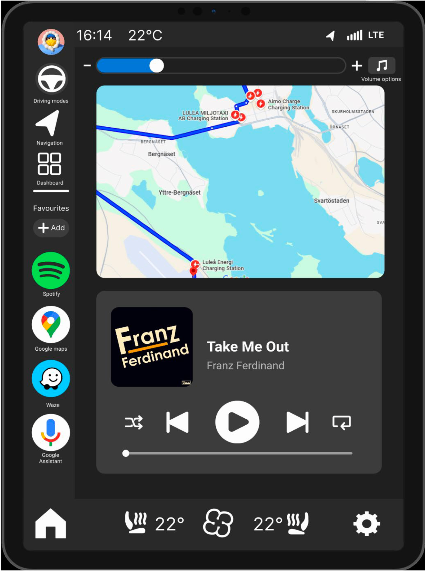
Concept B, the redesigned infotainment interface developed for the usability study.
- Project type
- UX Research · Usability Testing · HMI · Interaction Design
- Course
- Usability
- Year of study
- 4 of 5
- Duration
- Team
- Team of four
- My role
- Project lead · Usability study planning · Test facilitation · Data analysis · Report development · Collaborative interface concept development
- Tools & methods
- Figma · Driving simulator · Tobii Pro Glasses 3 · iMotions · Think-aloud · Counterbalancing · SUS · Product reaction cards · Thematic analysis · Time on task
- Prototype
- Two interactive Figma prototypes tested in a simulated driving environment
The challenge
The interface structure, feature placement and visual direction were developed collaboratively by the four-person team. Two team members had primary responsibility for building the prototypes in Figma, while I contributed to the shared design decisions and supported parts of the prototype development. My main responsibility was leading the project, coordinating the usability study, facilitating testing, analysing results and developing the report.
In-car interfaces must provide access to essential functions without demanding unnecessary attention from the driver. Our initial investigation identified several usability concerns in the existing interface, including unclear navigation, deeply nested controls and limited access to frequently used functions.
The study examined whether reorganising these functions could improve interaction efficiency and reduce the visual attention required while driving.
From problems to design hypotheses
The redesign focused on four testable changes: repositioning the control panel, adding a dedicated favourites area, keeping volume controls visible and moving the driving-mode selector into a more accessible side menu.
These changes were intended to shorten navigation paths, improve visibility and make frequently used functions easier to access during driving.
Control panel
Move frequently used controls into a more accessible position.
Favourites
Provide direct access to functions selected by the user.
Volume control
Keep audio controls visible instead of placing them deep in settings.
Driving mode
Move the selector into a consistent left-side menu.
Collaborative concept development
We visited a Volvo retailer to explore two infotainment systems and documented their structure and interaction patterns. Benchmarking of other automotive interfaces, including Audi and Mercedes-Benz, helped us compare approaches to hierarchy and feature accessibility.
The team then developed the interface structure, function placement and visual direction collaboratively. The selected concept introduced a home screen, persistent volume controls, a favourites area and clearer grouping of frequently used functions.
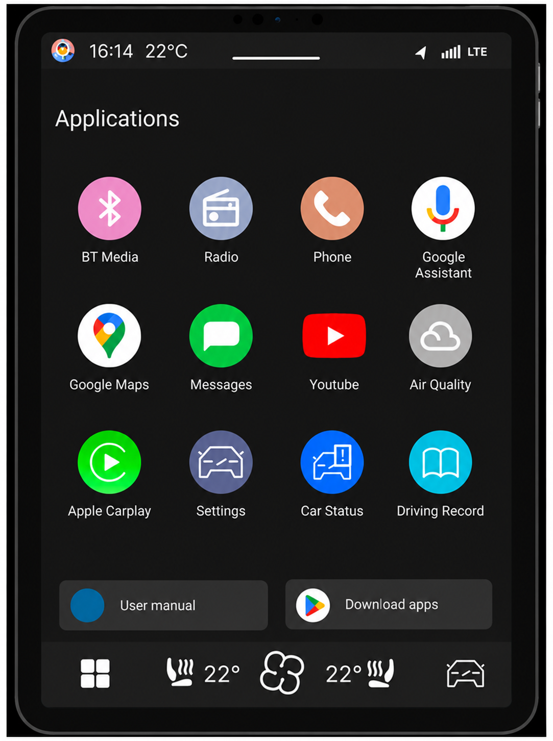
Concept A recreated the existing interface as the testing baseline, while Concept B introduced a clearer home structure, persistent controls and more accessible functions.
Study design
Ten licensed participants tested both interfaces while operating a driving simulator. Half began with the existing interface and half with the redesign to reduce learning and order effects.
Participants completed the same predefined tasks in both concepts. We combined task performance, driving data and eye-tracking with think-aloud feedback, SUS and product reaction cards to compare efficiency, attention and perceived usability.
10 participants
All tested both interface concepts.
Counterbalanced study
Five participants started with each interface.
Driving simulator
Measured driving deviation while participants completed secondary tasks.
Eye-tracking
Explored visual attention between the road and the interface.
Time and failure rate
Measured task efficiency and task completion.
Qualitative and subjective feedback
Think-aloud, SUS and product reaction cards supported interpretation of the results.
What the testing revealed
The results indicated that the redesigned interface improved task efficiency and reduced the number of failed tasks within this study.
Across the tasks included in the comparison, the average time decreased from 54.45 seconds in Concept A to 26.61 seconds in Concept B, an improvement of approximately 51%.
The largest differences appeared in tasks that required users to locate functions positioned deeper in the existing interface.
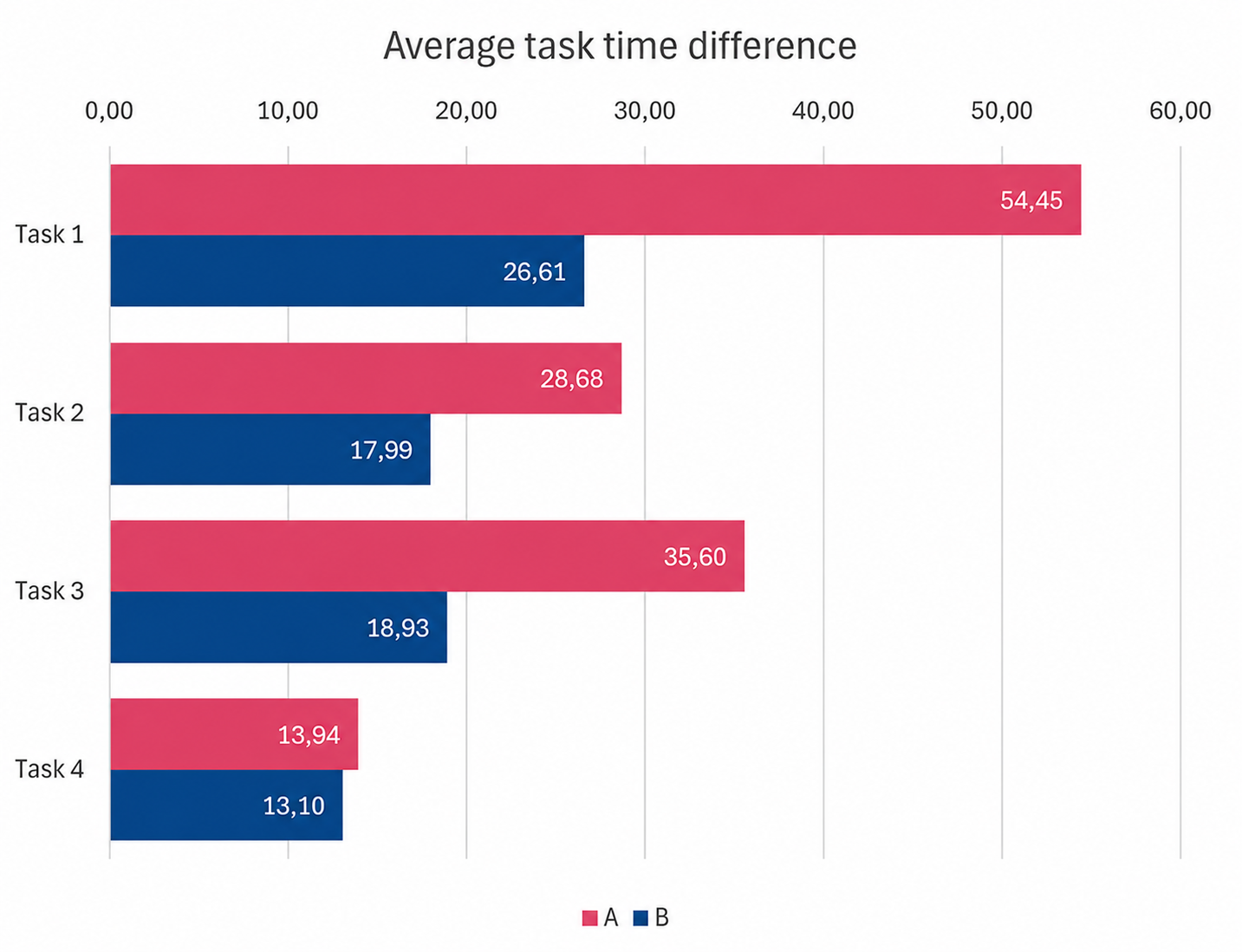
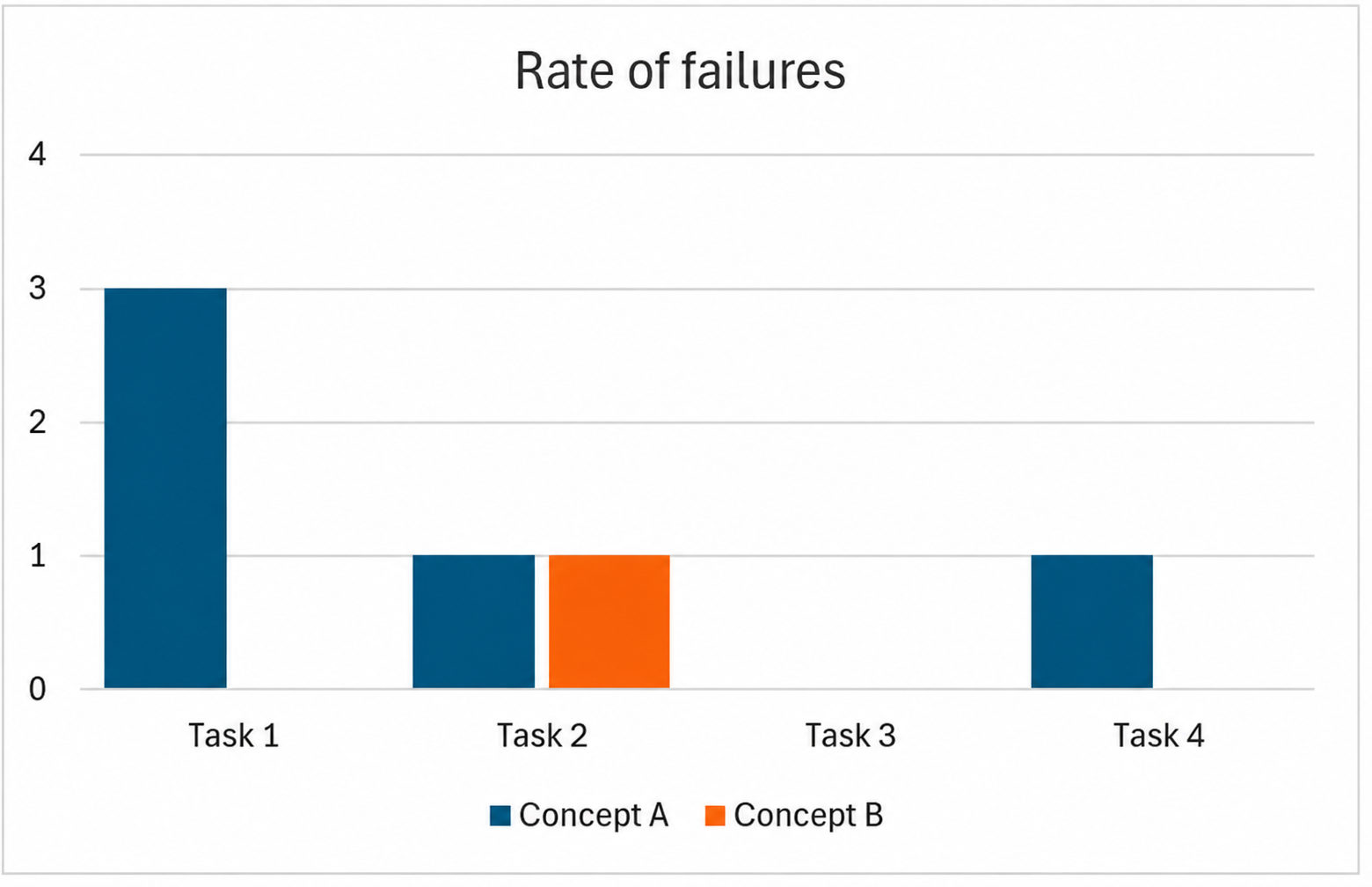
Concept A produced three failures in Task 1 and one failure in Task 4. Task 2 produced one failure in each concept, while Task 3 had no failures.
Note: Time data was available for nine of the ten participants. Failed tasks were not included in the time averages.
Driver attention and driving performance
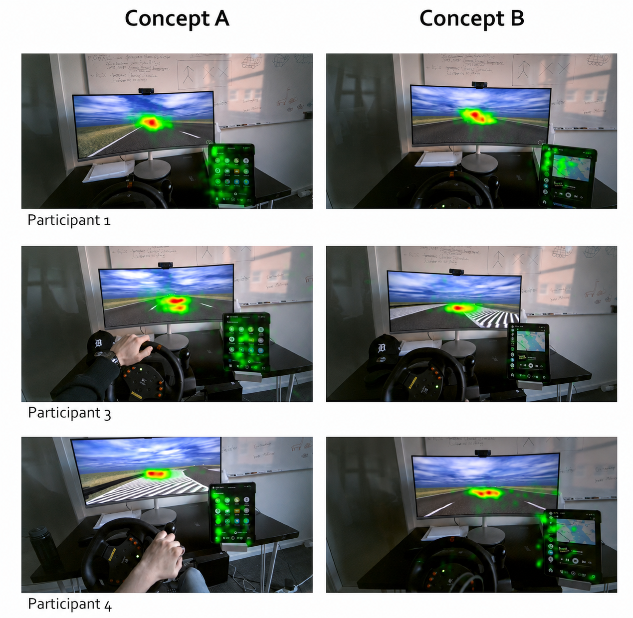
The valid eye-tracking recordings indicated that participants spent less time looking at the redesigned interface. However, two recordings were invalid because reflections from glasses interfered with the eye-tracking, and one additional recording was lost because of a technical issue.
Driving deviation was similar between the two interfaces, so the simulator data did not indicate a clear advantage for either concept in lane-keeping performance.
User perception
Participants generally described the redesigned interface as clearer, easier to navigate and more efficient. Persistent controls and more visible functions reduced the need to search through deeper menu levels.
The qualitative feedback supported the task-performance results, while also identifying areas that would require further refinement.
Limitations and interpretation
The study used a small and relatively homogeneous participant group in a simulated environment, so the findings cannot be generalised directly to real-world driving.
Some eye-tracking data was lost or invalid, and the prototypes included only the functions required for the study. The results therefore indicate promising usability improvements rather than validating a production-ready interface.
Key learnings
- Designing measurable comparisons — I learned how clearly defined hypotheses and comparable tasks make it possible to connect design changes to observable results.
- Coordinating a usability study — Leading the project strengthened my ability to organise a complex test setup, coordinate responsibilities and keep the team moving forward.
- Combining methods — Quantitative measures showed where performance changed, while think-aloud feedback and thematic analysis helped explain why.
- Interpreting imperfect data — Technical problems and inconclusive driving data reinforced the importance of reporting limitations and avoiding conclusions that extend beyond the evidence.