Product Design · Form Development
Organic Chess
A playful and tactile chess set developed as a group project through form exploration, moodboards, sketching and CAD modelling.
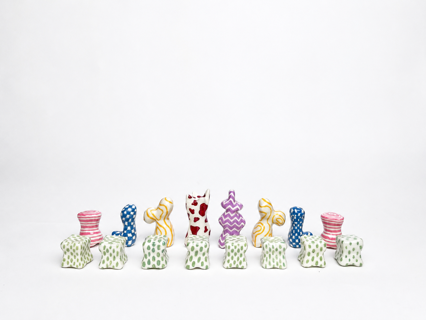
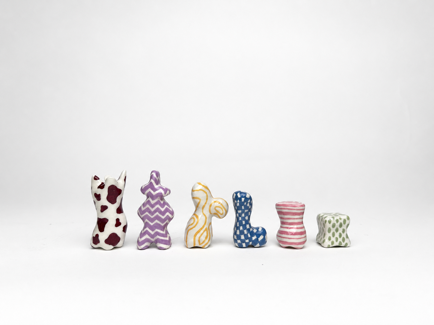
Final chess set combining organic forms, individual patterns and a shared visual language.
- Project type
- Product Design · Form Development
- Course
- Form Design
- Year of study
- Year 4 of 5
- Duration
- Team
- Team of four
- My role
- Concept development, moodboard creation, sketch exploration and SubD modelling of the queen in Alias
- Tools & methods
- Alias · SubD modelling · Moodboards · Sketching · 3D printing
- Prototype
- Complete physical chess set with six individual piece designs
Challenge and brief
The aim of the project was to develop a chess set with a more playful and tactile identity. As a group we wanted to move away from a strictly traditional expression and instead investigate softer silhouettes, organic form language and a more expressive visual character.
At the same time, the pieces still needed to function as a coherent set and remain distinguishable from one another.
Process and moodboards
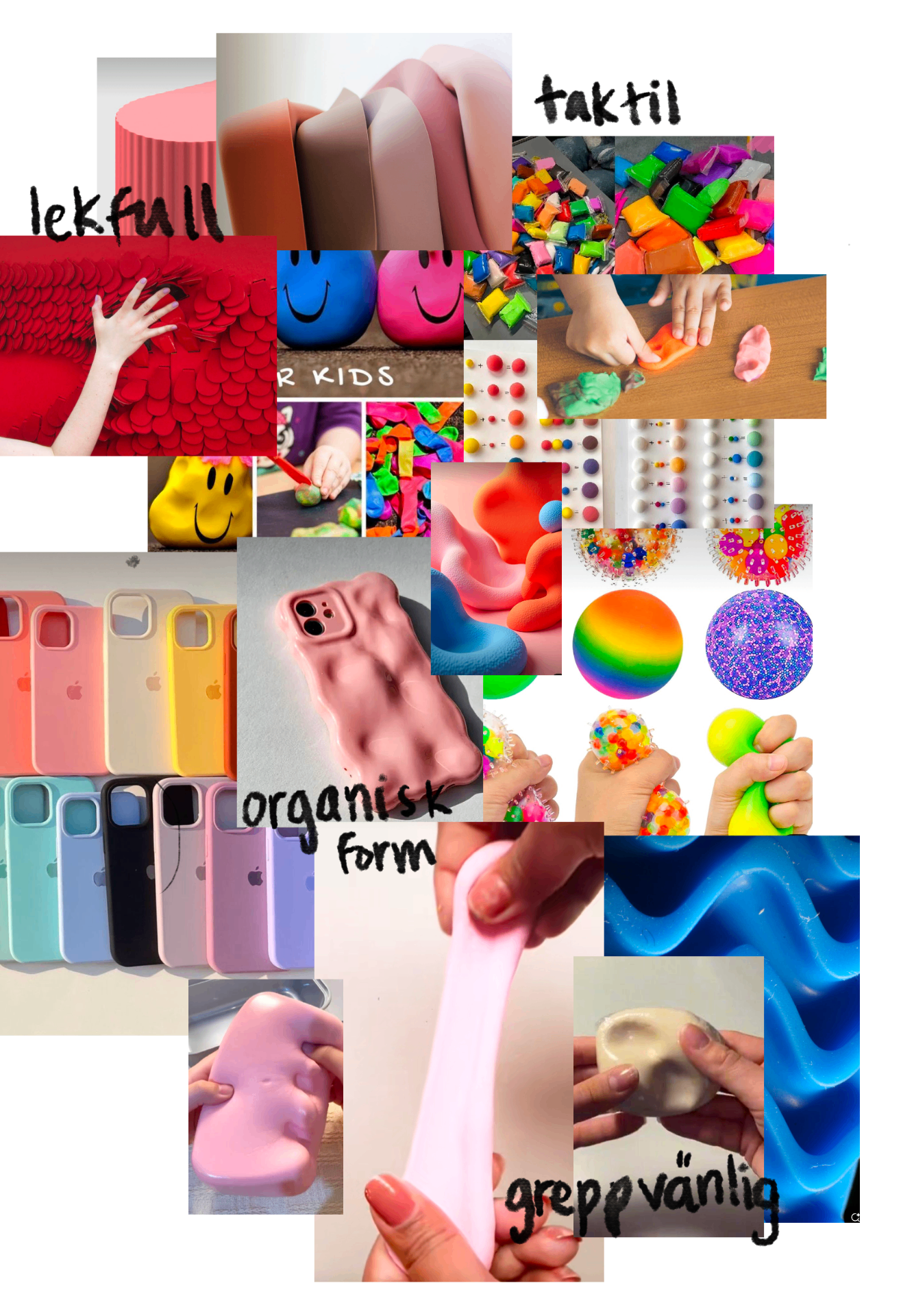
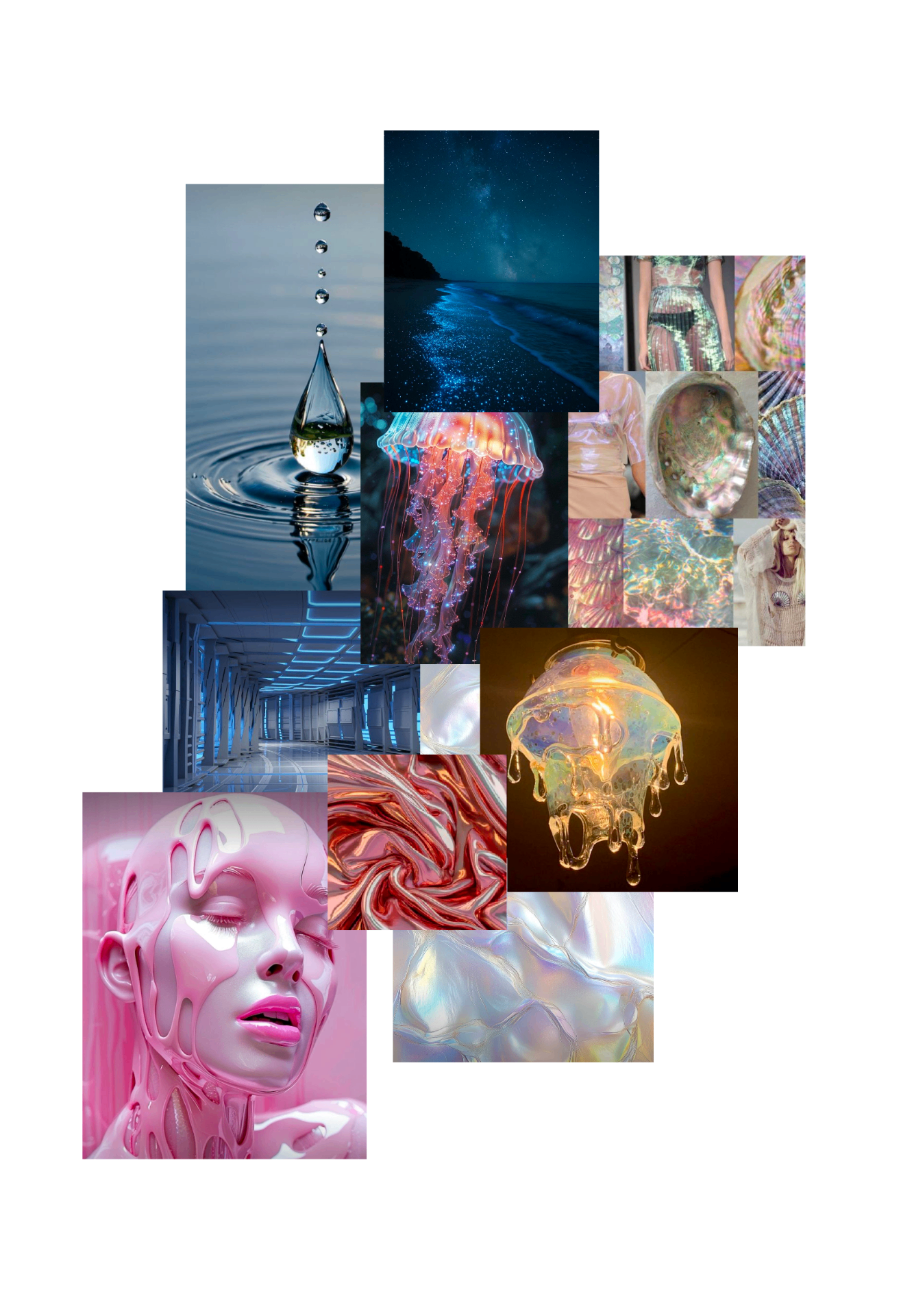
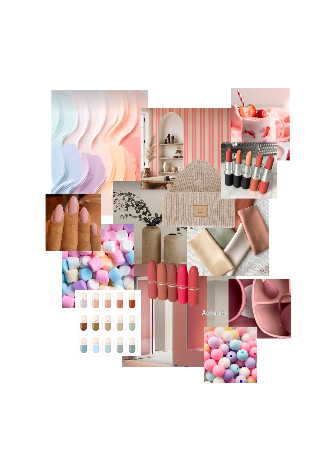
The process moved through inspiration gathering, individual concept generation, group discussions and refinement. Before the final direction was chosen, I explored several different visual and formal approaches on my own. These early explorations helped shape the discussion within the group and informed the direction we eventually developed further together.
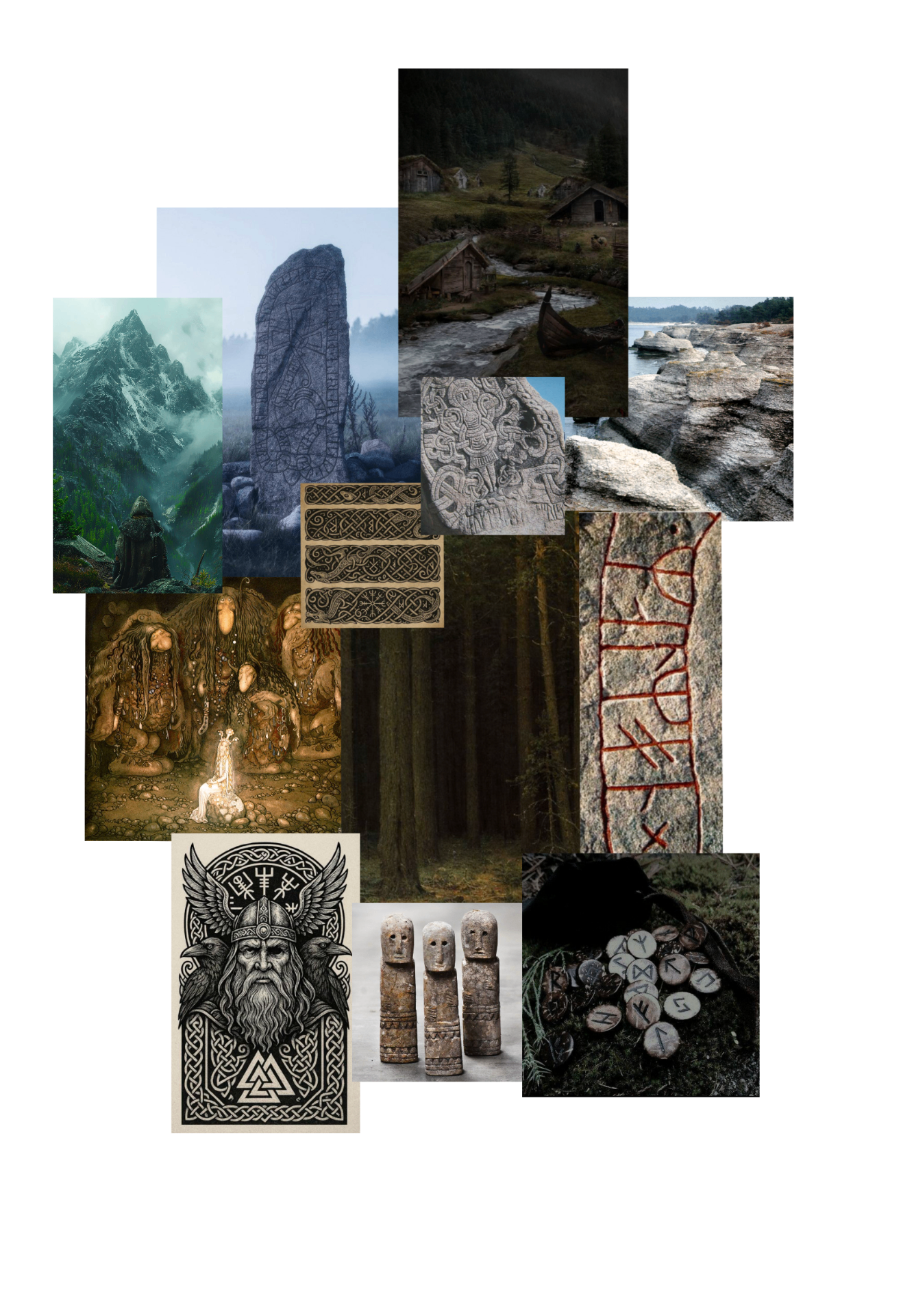
In the early stages, I created several moodboards to explore different emotional, visual and material directions for the project. These boards helped me test how the chess set could feel in terms of tactility, atmosphere, colour and form language. They were exploratory directions, and not all of them became the final project direction.
Concept development
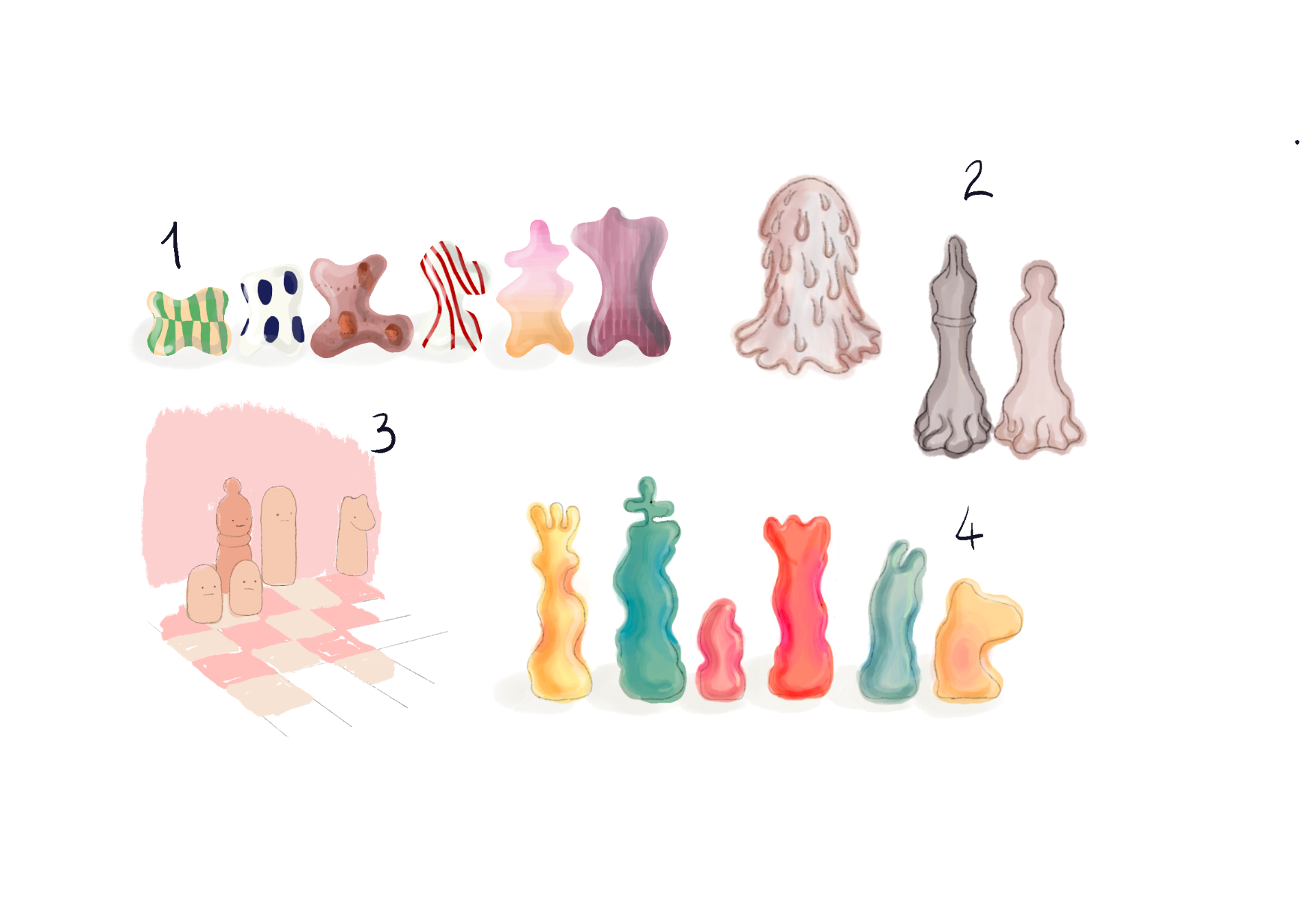
Before the final group direction was selected, I sketched several different chess set concepts to explore alternative identities, proportions and formal languages. These sketches helped me test how personality, hierarchy and recognisability could be expressed through shape.
I developed four different early concept directions. They varied in character and expression, ranging from softer and more rounded pieces to more stylised and sculptural silhouettes. The goal was to test different ways of giving the chess set personality while still maintaining a readable family of forms.
Group direction and my preferred palette
After group discussions about the direction we wanted to pursue, I created another concept that responded more directly to our shared interests in colour, pattern and organic form. The small set shown at the top left of this sketch sheet represents my interpretation of the direction we had started to align around as a group.
The colourful patterned direction shown here also reflects the colour and pattern language I personally would have liked to pursue further in the final set. The final colour choices were decided together as a group, and the finished project therefore followed a different colour direction.
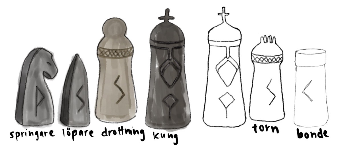
Alongside these softer explorations, I also developed a complete chess set concept inspired by a different formal language, shown with the Swedish labels springare, löpare, drottning, kung, torn and bonde. This concept explored a more structured and symbolic expression.
Form development
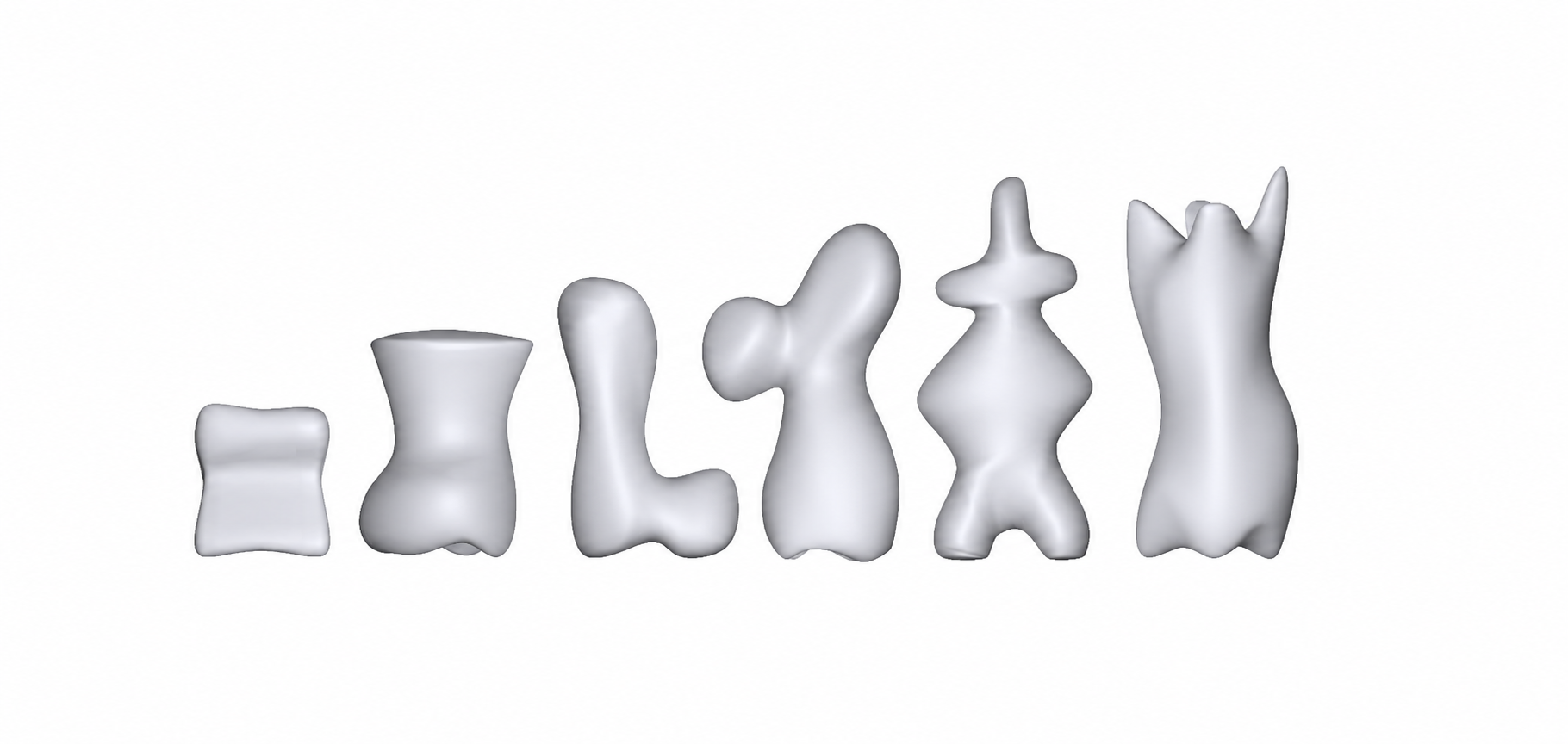
As the project moved from concept to refinement, the form language became more unified and organic. The pieces were developed as a family, with soft transitions and rounded silhouettes that made them feel playful and approachable while still maintaining internal variation.
My main individual modelling responsibility was the queen. I modelled the queen in Alias using SubD rather than NURBS, which allowed me to create soft, continuous and organic transitions. SubD was especially suitable for achieving the rounded sculptural quality that matched the overall direction of the set.
Although I was responsible for modelling the queen, the final project was developed collaboratively, and the overall visual direction was shaped through group discussion and shared decision making.
Final outcome
The final outcome is a chess set with a soft and organic identity. The pieces are intentionally rounded and playful, with a tactile expression that makes the set feel approachable and contemporary. The final collection presents a coherent family of forms while still allowing each piece type to keep its own identity.
The final colour direction was developed and decided collectively in the group.
Reflection
This project taught me a lot about balancing individual exploration with collective decision making. It strengthened my ability to generate multiple concept directions early in a process and to communicate those directions visually through moodboards and sketches.
On the technical side, it gave me valuable experience using Alias and SubD modelling to develop softer and more organic forms.
Key learnings
- Early moodboards and multiple sketch directions are a fast way to align a group on a shared visual language.
- Individual exploration and collective decision making both have their place in a group design process.
- SubD modelling in Alias is well suited to soft, continuous and organic geometry.